A CSS problem of 8M dollars and how to solve it !

Seasoned software developer with over 5 years of experience, specializing in front-end development with React, team leadership, and product management. A problem solver passionate about delivering high-quality software, driving team performance, and constantly improving skills while staying up-to-date with the latest technologies and techniques. Dedicated to helping companies achieve their goals and delivering value through software by seeking new and more efficient ways to do so.
Picture this:
Your company has just launched a new product or service, eagerly awaited by the market. The marketing campaign is in full swing, and customers are flocking to your website, cards in hand, ready to make their purchases. But then..., unexpectedly....
a bug strikes.
The checkout button on your website frustratingly remains just out of sight for ipad users, hidden below the screen's edge. Customers try to scroll up to complete their transactions, but as soon as they stop scrolling, the button frustratingly snaps back to its off-screen position.
Frustrating for your customers, right?
This is not a hypothetical scenario. It's exactly what happened to Darden Restaurants in 2021. A seemingly minor CSS issue led to monumental consequences, affecting at least 8 of their restaurant chains, each with the same website layout but under different branding.
The result?
-A challenging user experience, potentially lost sales, and diminished customer trust.
-The cost?
An estimated $8 million!!!
Can you imagine what you could do with $8 million? (Yes, I can imagine a lot! 😊)
So, what exactly happened here?
In the world of frontend development, viewport units like vw, vh, vmin, and vmax have been crucial tools since around 2012. These units allow developers to size elements relative to the viewport
vw(viewport width): 1% of the viewport's width.vh(viewport height): 1% of the viewport's height.
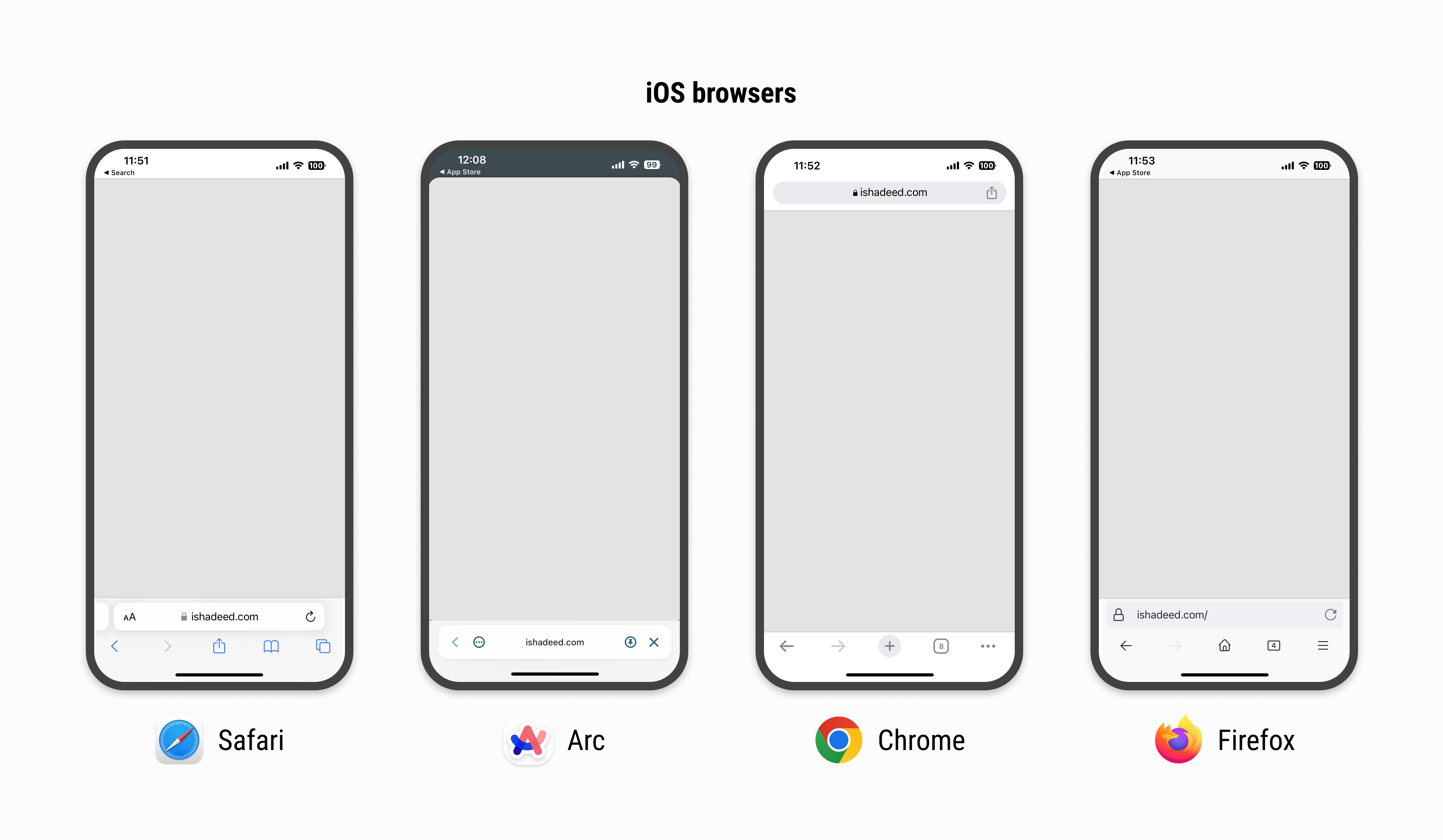
While these units generally perform well for desktop views, the scenario shifts dramatically on mobile devices and tablets. The user experience can vary significantly, influenced by the specific browser or device in use.
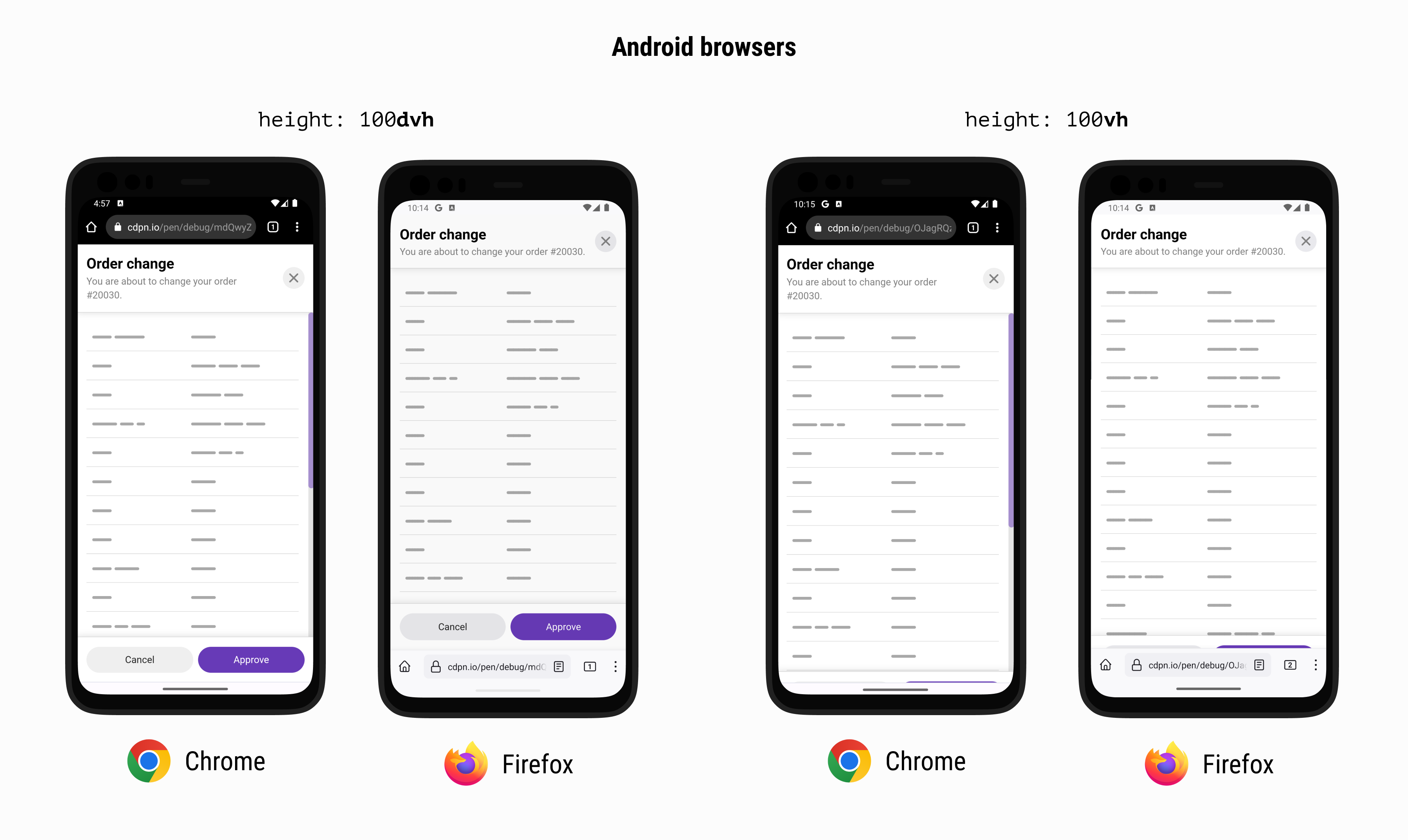
The core problem with using the vh (viewport height) unit on mobile lies in how the viewport size is calculated. It fails to include the browser's address bar and other UI elements. As a result, 100vh often extends beyond the actual visible portion of the screen, leading to layout issues and a suboptimal user experience.
But how can we fix this?
To find a solution, let’s turn to Bramus Van Damme, an exceptional developer who discovered the magic of 'view-source' at the age of 14. He introduces a viable solution in his article, “The Large, Small, and Dynamic Viewports.”
In this article, we focus on his concept of Dynamic Viewports.
A Dynamic Viewport dynamically adjusts its size to account for User Agent (UA) interface elements. It responds automatically to the visibility of these elements.
For Tailwind CSS users, there’s great news. Version 3.4 introduces classes to handle Small, Large, and Dynamic viewport units seamlessly within the framework. It can be as simple as:
<div class="h-dvh">
  <!-- ... -->
</div>
In conclusion, as developers, we must stay informed and aware of potential issues with our implementations, as well as solutions. Interested in a deeper dive into the Darden Restaurants case? Read about it
Or, if you're curious about Bramus Van Damme's insights, access his article
Thank you for reading!


